Dental Website Example: Anatomy of a Practice Site That Works
A real dental website example analyzed end to end. We break down the architecture, SEO, and conversion design behind Willow Family Dentistry's site.
Share:
Table of contents
What does a good dental website example look like?
A good dental website example combines a clear site architecture, local SEO signals, mobile-first speed, and conversion-focused design. The principles are well documented. The harder question is what they look like when applied to a real practice site, with real service pages, real local SEO setup, and real booking flow. This analysis breaks down Willow Family Dentistry, a practice site we built for a single-location family dental office in Wylie, Texas, and shows how each design decision maps to the principles in our dental website development guide.
The article is observation-only. We are not citing traffic numbers, ranking positions, or conversion rates. The point is to show what a modern dental website design looks like when the right architectural decisions get made up front, not to claim outcomes that need a separate analytics report to verify.
The site we are analyzing: Willow Family Dentistry in Wylie, TX
Willow Family Dentistry is a single-location family dental practice in Wylie, Texas, founded by Dr. Esther Jeong. The site sits at willowfamilydds.com and serves patients across Wylie, Murphy, Sachse, and the surrounding Collin County area. It is a useful dental website example because it is small enough for the architectural decisions to be visible, recent enough to reflect 2026 standards, and practical enough that the same patterns apply to most single-location practices.
Three things are worth noticing immediately on the homepage.
Homepage analysis
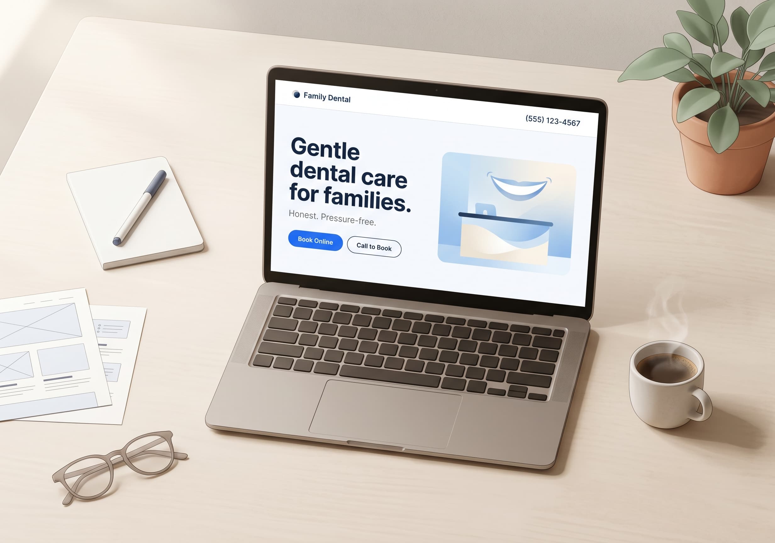
What a patient sees in the first 5 seconds.
Gentle, judgment-free dental care for Wylie families.
Honest, pressure-free dentistry. No upselling. No lectures.
None of this is fancy. The header has a logo, a phone number, and a Book Appointment button. The hero has a clear headline that names the city, a one-line value proposition that does not over-promise, and two equal-weight calls to action. The patient understands what the practice is, who it serves, and how to get an appointment within seconds of landing on the page. That is the entire job of a homepage.
Want to see more dental website examples we have built?
DentalBase builds modern, fast, conversion-focused dental practice websites with SEO baked in from day one.
View Our Services →How does the site architecture support search rankings?
The site is structured around dedicated service pages rather than a single Services index. Willow runs seven separate service pages: Preventive, Pediatric, Cosmetic, Restorative, Orthodontics, Sedation, and Emergency. Each one targets a distinct patient search intent and gives Google a clear signal about what the practice offers and ranks for.
This is the foundational SEO architecture decision. A practice that lists all services on one page asks Google to guess which keywords matter most. A practice with dedicated pages tells Google directly. The URL pattern adds a second signal. Each service page lives at a clean URL like /dental-services/cosmetic-dentistry-wylie-tx, with the service name and the city included.
Site architecture
Willow Family Dentistry's service page structure.
URL pattern
/dental-services/[service-name]-wylie-tx
The supporting structure makes this stronger. The blog at /dental-health-tips publishes educational content that links back to the relevant service page. A blog post about teeth whitening links to the Cosmetic page. A post about emergency tooth pain links to the Emergency page. This is how content clusters get built and how topical authority compounds over time. We covered the architectural principle in detail in the dental website development guide.
What modern dental website design looks like in practice
Modern dental website design has settled around a few patterns that consistently outperform the older approaches. The Willow site is a useful dental website example for showing how those patterns combine.
The site uses a clean, single-column hero on mobile that stacks the headline, the value proposition, and the two CTAs vertically. On desktop, it shifts to a two-column layout with the team photo on the right. The typography is large enough to read on a phone without zooming. The color palette is restrained: navy, white, and a soft accent. There are no popups, no auto-playing videos, no aggressive newsletter signup interruptions.
Speed is the technical foundation underneath all of this. The site loads quickly on mobile because the images are properly sized and lazy-loaded, the hosting is on a CDN, and the pages do not pull in unnecessary scripts. Speed is also a Core Web Vitals ranking factor, so it serves both users and search engines. Google uses mobile-first indexing, so the mobile experience is what gets evaluated for rankings. Most older dental sites fail this test by carrying outdated themes that load 30+ scripts and 4MB of unoptimized images.
The navigation is intentionally simple. Six items in the main menu: Home, About, Services, Patient Resources, Blog, Contact, plus the Book Appointment CTA on the right. Patients find what they need in one click. The mobile version collapses to a hamburger that exposes the same six items. There is no mega-menu and no nested submenu.
How does a Wylie practice get found by Wylie patients?
Local SEO is the highest-impact area for a single-location dental practice. Most patient searches are location-specific: "dentist in Wylie," "emergency dentist near me," "pediatric dentist Wylie TX." The practice that wins those searches captures the majority of high-intent traffic.
Willow's site sets up the local SEO signals carefully. The city appears in the homepage hero, in the meta titles, in the URL pattern of every service page, and in the address line at the footer. The Google Business Profile lists the practice as a Dentist with the correct address, phone, and hours. Reviews are accumulating steadily, the site shows a 5.0 rating with over 100 verified reviews. This is consistent with the local SEO principles we outlined in Why Local SEO Matters for Dentists.
Local SEO setup
willowfamilydds.com
A local SEO foundation built before launch is much cheaper than retrofitting it after the fact.
Service area mentions are a smaller signal but worth getting right. Willow names the surrounding cities (Wylie, Murphy, Sachse) in the testimonial copy and in the service area description. This helps the practice show up for searches from neighboring towns where patients might be willing to drive 10 to 15 minutes for the right dentist. Read more on the topic in our guide to dental keywords.
Want a website with this kind of SEO foundation?
DentalBase builds modern dental practice websites with local SEO, schema, and content architecture set up from day one.
Book a Free Demo →How does the site turn visits into appointments?
Conversion design is what separates a website that ranks from a website that books patients. Willow's site is engineered to remove friction at every step from arrival to booking.
Three elements are visible within five seconds of landing on the homepage: the phone number in the header, the Book Appointment button, and the value proposition that names the city. There is no scrolling required to take action. On mobile, the phone number is a tap-to-call link, which is the highest-converting CTA on any dental site because it removes one decision point entirely.
Conversion path
From arrival to booked appointment.
Arrival
Patient lands on homepage. Sees phone, Book button, headline that names Wylie. Knows in 5 seconds this is the right practice.
Decision
Two clear paths: tap phone number to call, or click Book Online. New patient page and insurance verification answer the questions that block bookings.
Action
Booking form or live phone call. Confirmation. Appointment in calendar. The entire flow from arrival to booking can take under 90 seconds.
Each step removes one friction point. Conversion is the cumulative result.
The insurance verification flow deserves its own mention. Insurance is the most common reason a patient hesitates before booking. Willow's site preempts the question with a dedicated insurance and financing page that lists accepted carriers, mentions free verification, and provides a one-click path to call and verify benefits. By moving this answer above the booking decision, the site removes a friction point that costs many practices their conversions.
The Book Appointment button uses the same color and the same words on every page. Consistency reduces decision fatigue. A patient who clicks Book Online from the hero, the navigation, the services page, or the contact page sees the same flow each time. There is no second-guessing whether the button does what it says.
What trust signals reduce booking friction?
Trust signals are the elements that reduce a patient's risk perception before they commit to booking. Willow uses several that work harder than the polished stock-photo approach most practice websites still rely on.
The founder story is specific and human. Dr. Esther Jeong is a Loma Linda University DDS, a mother of five, a half-marathon runner, and a volunteer on dental missions in Belize, Honduras, Korea, and Bangladesh. None of that is generic credential copy. A patient choosing between three local practices reads that and recognizes a person, not just a license. The cost of writing this kind of copy is hours of conversation with the dentist. The benefit is a website that feels different from every competitor in the market.
The testimonials use real first names and city locations: Sarah M. in Wylie, Jin K. in Murphy, Jennifer L. in Sachse. The Korean-language testimonial does work most websites do not even attempt. It signals to the local Korean community that the practice serves them in a meaningful way, which is a real differentiator for a Wylie-area family practice. This is community-fit signaling, not generic social proof.
The honest copy is its own trust signal. The hero promises "no upselling, no lectures." The about section openly says "we built ours differently" because most patients dread the dental office. Most dental sites avoid acknowledging the patient anxiety problem because they think it is unprofessional. Willow names it directly and offers a different experience, which immediately separates the site from the field.
Related: The full breakdown of the principles applied here. → The Ultimate Guide to Dental Website Development
What we would build the same way for any practice
The decisions on Willow's site translate directly to other single-location practices. What makes this a useful dental website example is that none of them depend on Wylie specifically, on the family-practice model, or on Dr. Jeong's particular biography. They are repeatable patterns.
Dedicated service pages for every meaningful treatment, with the city in the URL and the title. A clean URL pattern that scales. A blog that publishes patient-question content and links back to relevant service pages. A homepage that shows the phone, the book button, and the city in the headline above the fold. A consistent Book Appointment button across every page. An insurance verification page that preempts the most common booking objection. A founder story that names a real person, not a credential list. Testimonials with first names and cities. Honest copy that names the patient's actual concern (anxiety, cost, time) instead of avoiding it.
The technical foundation underneath: mobile-first responsive design, fast Core Web Vitals, HTTPS, schema markup, lazy-loaded images, no popups, no auto-playing video. These are not optional in 2026, and getting them right at launch is much cheaper than retrofitting later.
For a deeper read on the principles that drive each of these decisions, see the complete dental website development guide and the dental website designs guide.
Ready to Build a Website Like This for Your Practice?
DentalBase builds modern, fast, conversion-focused dental websites with SEO baked in from day one. Book a 15-minute demo to see the platform.
Book a Free Demo →Want more practice growth resources?
Browse Resources →Frequently Asked Questions
A good dental website example has dedicated service pages with cities in URLs, mobile-first responsive design, fast Core Web Vitals scores, a clear booking flow, consistent NAP details, and a Google Business Profile with steady review velocity. The architecture is simple, the navigation is uncluttered, and the patient can take action within 5 seconds of arriving.
Modern dental website design uses mobile-first responsive layouts, dedicated service pages instead of bullet lists, clean URL patterns with city names, schema markup for rich results, and conversion-focused CTAs visible above the fold. Older designs typically rely on a single Services page, slow themes with 30+ scripts, and generic stock-photo content with no local signals.
A dental website needs the city name in the homepage headline, in meta titles, and in service page URLs. It needs consistent name, address, and phone (NAP) across the site, the Google Business Profile, and all directories. It needs Dentist or LocalBusiness schema markup, and a steady flow of new Google reviews. Service area mentions for neighboring towns also help.
A dental website should make booking visible in the header on every page with a consistent button color and label. Mobile users need a tap-to-call phone number as the highest-converting alternative. The booking flow itself should preempt common objections like insurance verification by surfacing those answers before the booking decision.
Willow Family Dentistry at willowfamilydds.com is one example we built and analyze in this article. For the principles that apply to every dental website example we build, see our complete guide to dental website development. For the design and visual side, see our 2026 dental website designs guide.
Was this article helpful?
Written by
DentalBase Team
Expert dental industry content from the DentalBase team. We provide insights on practice management, marketing, compliance, and growth strategies for dental professionals.