Dental Website Booking: Turn Visitors Into Appointments
Most dental website booking flows lose patients at the click. Fix forms, mobile flow, and after-hours capture so visitors actually book appointments.
Share:
Table of contents
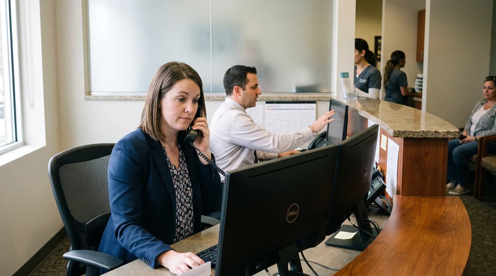
Dental website booking is a quiet failure mode for most dental practice sites. The button is there. The path behind it carries enough friction that visitors give up.
Traffic shows up, the page loads fast, the design looks fine, and almost no one books. Long forms, hidden booking buttons, mobile flows that fight the thumb, voicemail at 11:00 PM. Each problem looks minor by itself. Stacked together, they cap conversion at a rate that makes paid traffic feel like a bad investment.
This piece walks the path a real visitor takes, from the first click to a confirmed time, and points to the specific places where practices lose them. Each fix is small. Stack four, and bookings move.
Why does dental website booking fail at the click?
Dental website booking fails because the visible action and the actual conversion are two different things. A button on the homepage gets clicked. A form gets started. Then patients hit a friction point, drop off, and the practice never knows they were there.
Most owners measure the wrong stage. You see traffic in analytics. You see clicks on the booking link. What you do not see is the abandonment between the click and the confirmation page. HubSpot's conversion research consistently finds that landing page form abandonment runs between 60% and 80% across industries, with longer forms at the worse end of the range.
Dental sites have their own version of this. A visitor arrives via Google or a referral, scans the homepage in five to ten seconds, taps a booking link, gets a form that asks for too much, and bails. Or worse, the booking link drops them into a generic contact form labeled "Request Appointment" with a 24 to 48 hour response promise. A patient with a toothache is not waiting 48 hours. They are calling the next result.
The polite-but-unused button is the most common offender. Practices include it because every modern dental site has one. They do not test it. They do not watch a real visitor try it. The button stays on the page for years, generating clicks but almost no bookings.
These mechanics sit inside a broader system. Strategy, design, SEO, and conversion all connect, which we cover in our complete guide to dental website design.
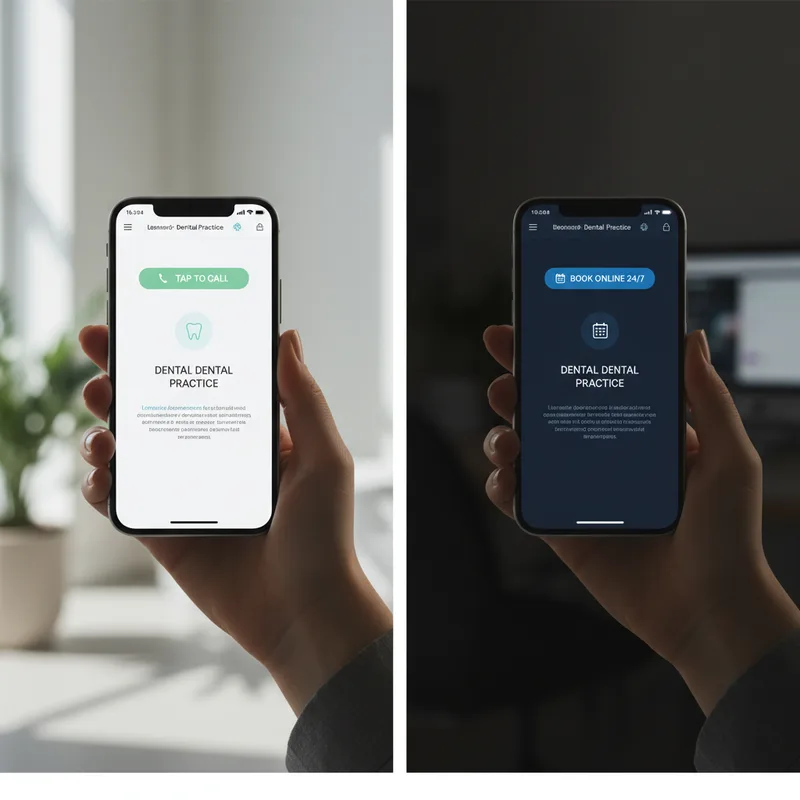
Click-to-call or online booking? Picking the primary action.
On mobile during business hours, click-to-call wins. Patients want a live voice and an answer. Online booking wins after hours and during the workday for working patients who cannot phone. The decision is not either-or. It is which one your homepage shows first, by device and time.
BrightLocal's local consumer research has tracked click-to-call behavior on local-business searches for years. On healthcare-related searches from mobile, calls remain the dominant conversion action. Patients want a person, especially for first appointments where insurance, scheduling, and a quick "do you do that?" question all matter at once.
That changes after 5:00 PM. The same patient who would have called at 2:00 PM is now scrolling at 9:30 PM. The practice phone is closed. Voicemail is the worst possible outcome. Dental Economics coverage of practice marketing notes that after-hours inbound represents a significant share of total dental call volume, depending on practice type.
The fix is device-and-time aware design. On mobile, during business hours, the primary action is a large tap-to-call button at the top of the screen. After hours, that same button can swap to "Book online" or sit alongside a 24/7 capture option. Desktop visitors typically want online booking regardless of the hour.
Run this test on your own site: open it on your phone at 9:00 AM, then at 9:00 PM. If the primary action does not change, you have a design problem.
Click-to-call only works if someone picks up.
If your phone goes to voicemail during peak hours, the booking button is doing the work alone. See how an AI receptionist picks up the calls your front desk cannot.
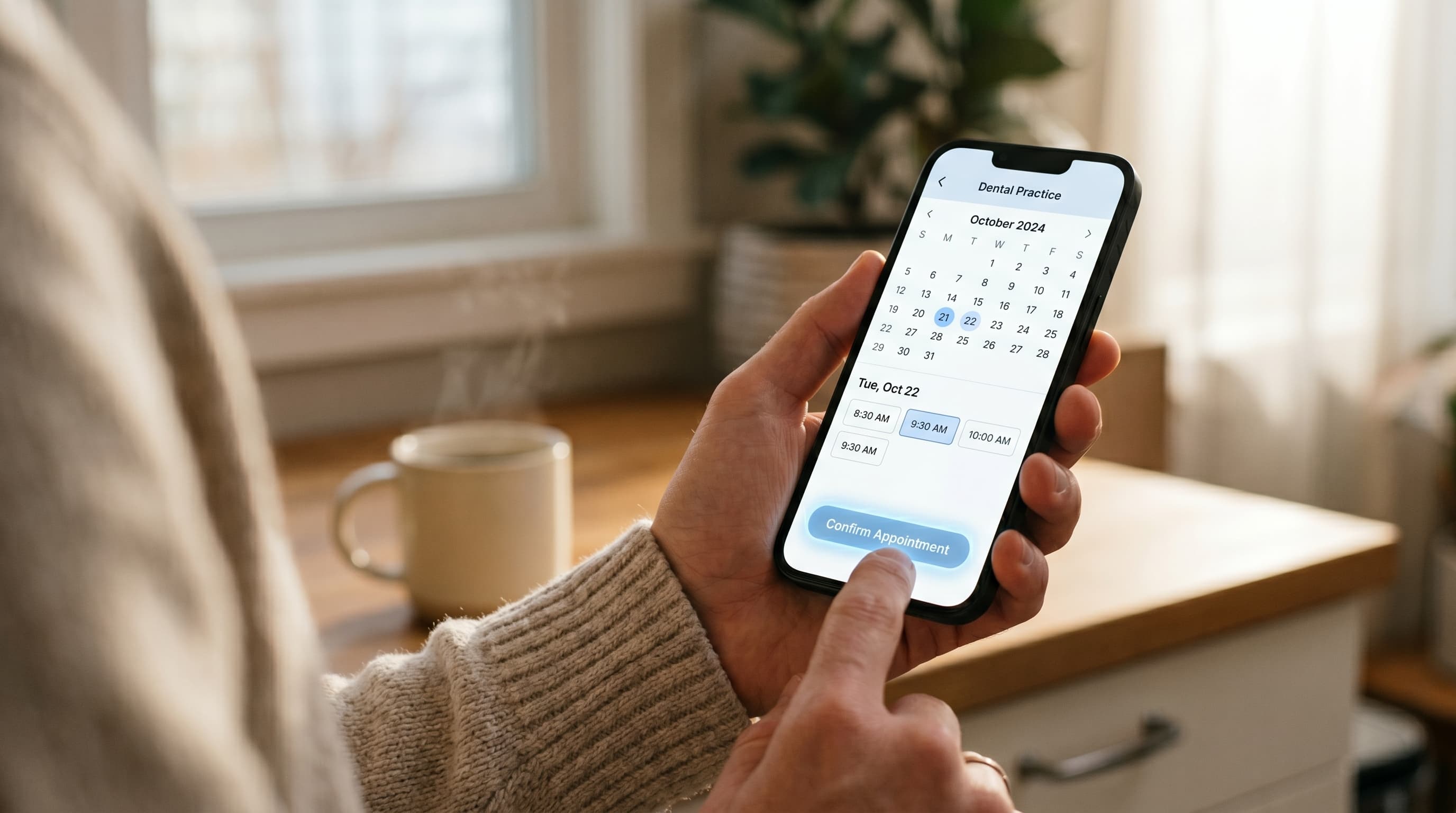
See how it works →How long should a dental website booking form be?
Three to five fields. Name, phone, preferred date or time range, reason for visit, and optional insurance carrier. Anything more belongs on a second screen after the patient commits, not before. Long forms feel like work, and patients abandon work.
Form length and completion rate run in opposite directions. Cutting a form from 11 fields to 4 has been shown in published UX research to lift completions by triple-digit percentages, depending on baseline. Dental practices regularly run 8 to 15 field forms at the front door. Date of birth, full address, insurance ID, secondary insurance, employer, emergency contact, all on the first screen. None of that is needed before you confirm an appointment slot.
The patient gives you their time and contact info, you confirm a slot, and then you ask for the rest. Either through a follow-up intake form, an email link, or in person at check-in. This is the standard progressive-disclosure pattern used outside dentistry. For booking, the current step is "match this patient to a time," not "complete their chart."
What about insurance verification?
You do not verify insurance at the booking step. Capture the carrier as an optional field, then verify after the slot is held. Most patients do not know their plan details by memory, and forcing them to look it up at 9:30 PM is the fastest way to lose them.
Patient intake forms collect protected health information, which means your form architecture is also a compliance question. Read how to build a HIPAA-compliant dental website before you launch a new intake or booking form.
For a deeper look at how to split data collection across before, during, and after a visit, see our piece on intake software that reduces front desk workload.
Why do dental practices lose most bookings on mobile?
Mobile carries most dental search traffic, but most dental site booking flows were designed for desktop and never retested on a phone. Tap targets get smaller, the booking button drops below the fold, and the form fields lose their proper input types. Each is fixable in an afternoon.
Diagnostic
Mobile booking: the four most common failure modes
| Failure mode | What to check | Fix |
|---|---|---|
| Tap targets too small | Buttons under 48 pixels | Set 48px minimum on interactive elements |
| Booking button below fold | Scroll required to find "Book Now" | Move CTA into the top viewport |
| Wrong input types | Phone field set as type="text" | Use type="tel" and type="email" so the keyboard adapts |
| Modals covering the form | Cookie banners, chat widgets, exit popups | Suppress overlays on booking pages |
Google's mobile sites documentation has been the official ranking standard since mobile-first indexing rolled out. Mobile is no longer the secondary case. For local services like dentistry, mobile usually drives the majority of new-patient sessions, especially evening and weekend searches.
What goes wrong on a phone:
- Tap targets under 48 pixels. Apple's accessibility guidelines and Google's Material Design both call for 48 pixel minimums on interactive elements. Most dental site booking buttons fail this on mobile.
- Booking button below the fold. If a patient has to scroll past a hero image, a video, and a service grid to find "Book Now," half of them never see it.
- Form fields without proper input types. A phone number field set as type="text" instead of type="tel" forces patients to switch their keyboard manually. Many abandon at that switch.
- Modal dialogs that cover the form. Cookie banners, chat widgets, exit-intent popups. On a 5.5 inch screen, one of these covering 30% of the form is a near-guaranteed bounce.
Page weight matters too. A homepage that takes eight seconds to load on 4G has already lost most of its mobile visitors. We cover the speed side of this in detail in our piece on fixing a slow dental website.
Open your site in incognito on a phone, connected to mobile data rather than Wi-Fi. Time how long the booking button takes to appear. Anything above three seconds, fix the page weight before you touch anything else. Then go through the checklist above with your thumb only. If you cannot complete the booking with one thumb, neither can your patient.
See your booking flow scored.
Get a free audit of your site's booking path, with the specific fixes ranked by impact on conversion.
Request a Demo →What should happen after they hit "submit"?
A real confirmation, not just a thank-you message. The patient needs to see their requested time, a clear next step, a contact phone if anything goes wrong, and an automated email or text within two minutes. Anything less, and they assume the submission failed.
The thank-you page is the most under-optimized page on most dental sites. Owners spend three weeks debating the homepage hero, then drop a default "Thank you, we will be in touch" message on the page that decides whether the patient feels confirmed. Patient communication standards covered in ADA practice resources emphasize timely, specific confirmations rather than vague acknowledgments, particularly for new patients still deciding whether to trust a practice.
What a working thank-you page does:
- Restates what was booked, with the exact requested date and time range.
- Sets expectations on confirmation. "You will hear from us within two hours, Monday to Friday 8 AM to 5 PM." Patients want a number.
- Gives a fallback contact at the top. Phone number, click-to-call. If the patient changes their mind or thinks they hit submit twice, they call you, not a competitor.
- Provides a what-to-bring checklist for the visit. Reduces no-shows by giving patients something concrete to do next.
- Triggers an automated email or text within two minutes. Transactional confirmations get opened at far higher rates than marketing email, and patients expect this from any service business.
The confirmation flow is also where reminder mismatches start. If your booking system sends a "confirmed for Tuesday" email when the practice management software is still showing the slot as "requested, awaiting review," you have a coordination problem that will cost you no-shows downstream.
Related: A booked patient is wasted if the reminder never arrives. → Why dental appointment reminder problems keep happening
How do you capture after-hours website booking attempts?
After-hours is where most dental website booking traffic actually arrives. Patients browse at 9:00 PM, the front desk closed at 5:00 PM, and voicemail kills the conversion. The fix is a 24/7 capture channel: either a working online booking system that holds slots in real time, or an AI receptionist that answers and books.
Two patterns that solve after-hours capture
Pattern 1
Real-time online booking
- Widget shows actual open slots
- Holds the slot when a patient picks it
- Confirms by email within minutes
- Same calendar your front desk sees
Best for: digital-first patients, weekday evenings
Pattern 2
AI phone agent
- Answers calls 24/7
- Books appointments into your calendar
- Texts patient confirmation automatically
- Handles overflow and after-hours volume
Best for: practices with heavy phone volume
Two facts. Most healthcare-related searches happen outside business hours. Voicemail almost never converts to a booked patient. Combined, this is the largest leak in most dental website booking funnels, and the easiest to fix. Local service queries skew heavily toward mobile and toward off-hours, with peak activity in early evening and weekends.
Two patterns work:
Pattern 1: Real-time online booking. The booking widget on the homepage shows actual open slots, holds the slot when a patient picks it, and confirms by email within minutes. Patients see the same calendar your front desk sees. No request-and-wait, no "we will be in touch." The slot is theirs. Most dental sites think they have this. Most do not. We cover the gap in detail in our piece on why most online booking dental software does not actually book.
Pattern 2: AI phone agent that books to your calendar. For practices with heavy after-hours call volume, an AI receptionist like DentiVoice answers 24/7, books appointments into the same system the front desk uses, and texts the patient a confirmation. Both patterns solve the same underlying problem: never sending a real patient to voicemail.
Some practices need both, especially multi-location practices where call volume varies by site. A single bottleneck channel at 9:00 PM is the difference between a booked new patient and a competitor's booked new patient.
If you are choosing between the two, start with whichever channel is currently leaking the most. Look at your call logs for after-hours volume. Look at your site analytics for evening traffic that does not convert. Whichever number is larger, fix that channel first.
Bringing it together
The pattern across every section above is the same. Most dental website booking failures are not strategic, they are mechanical. The button is in the wrong place. The form asks for too much. The thank-you page is silent. The phone goes to voicemail.
Each fix is small. The reason owners do not make them is not cost or technical difficulty. It is that nobody on the team has watched a real patient try to book on the practice site recently. Once you do, the friction points become impossible to ignore.
Pick one fix this week. Shorten the form, swap the mobile primary action, rewrite the thank-you page, or plug the after-hours leak. Then measure the change. Most practices doubling their conversion rate did it one mechanical fix at a time.
Want a conversion audit of your booking flow?
See the exact friction points on your site and the fixes ranked by impact. Free 20 minute walkthrough.
Book a Free Demo →More dental growth resources
Browse Resources →Sources & References
Frequently Asked Questions
Three to five fields: name, phone, preferred time range, reason for visit, and optional insurance carrier. Anything more belongs on a follow-up form after the slot is confirmed. Longer forms cut completion rates sharply.
Both, switched by device and time. Click-to-call wins on mobile during business hours. Online booking wins after hours and on desktop. The mistake is showing the same primary action to every visitor regardless of context.
Within two minutes by email or text. Patients who do not see a confirmation within minutes assume the submission failed. Many will resubmit, leave the page, or call a competitor instead.
The booking path has friction between the click and the confirmation. Common causes are forms with too many fields, booking buttons hidden below the fold on mobile, slow page load, and voicemail after hours. Fix one at a time and measure each.
After-hours represents about 27% of total inbound dental call volume. Website traffic skews even more toward evenings and weekends, since patients research outside their own work hours. Voicemail loses most of this traffic.
Yes. Mobile booking needs 48 pixel tap targets, the booking action above the fold, proper input types for phone and email, and no overlapping modals. A desktop booking flow scaled down to mobile typically fails on all four counts.
A restatement of the requested time, a confirmation timeline, a fallback phone number, a what-to-bring checklist, and an automated confirmation email or text. The thank-you page is the moment the patient decides whether they trust the practice with their time.
Was this article helpful?
Written by
DentalBase Team
Expert dental industry content from the DentalBase team. We provide insights on practice management, marketing, compliance, and growth strategies for dental professionals.