How Mobile Dental Website Design Wins More New Patients
Most new-patient research starts on a phone. See the mobile dental website audit: thumb targets, page weight, click-to-call, and a booking flow that converts.
Share:
Table of contents
Why does mobile-first dental website design matter now?
Mobile-first dental website design matters because most local patient search now happens on phones. Google ranks sites based on what its mobile crawler sees, not the desktop version. A site that's broken or stripped down on mobile is invisible to the way new patients actually find your practice in 2026. Mobile performance is one ranking input among several, so it helps to know what dental SEO services should deliver across the whole program.
Google switched to mobile-first indexing as the default in 2019. The crawler now uses the smartphone version of your site to decide where you rank in local results. If your phone view is broken, slow, or missing features that exist on desktop, that broken version is the one being scored. Google's mobile-first indexing documentation walks through which signals it pulls and how the switch works.
The patient side mirrors the algorithm side. New patient searches usually start on a phone, often after a referral or a passing thought. Google's research shows 53% of mobile site visits are abandoned when pages take longer than three seconds to load. If a new patient has to pinch to zoom, hunt for a tiny call button, or wait through a slow load, the next result on the page gets the call.
Building a strong mobile experience is one layer of a site that actually books patients. For the full picture of how design, conversion, SEO, and vendor selection connect, see our complete 2026 guide to dental website design. It covers every piece that surrounds the mobile build.
The simplest test? Open your site on your own phone right now. Time how long it takes to find the phone number and tap it. If that takes more than three seconds, the patient version of you is already on a competitor's site.
What does a thumb-friendly dental website look like?
A thumb-friendly dental website uses tap targets of at least 48 by 48 pixels, places the most important action in the lower half of the screen, and leaves visible space between every clickable element so patients can't fat-finger the wrong button on a moving subway.
The 48-pixel rule comes from Google's Material Design specs and Apple's Human Interface Guidelines, which use 44 points. Anything smaller demands precision that real thumbs on a moving phone screen don't have. Moz's guide to mobile optimization covers the same territory from the SEO angle: tap target failures hurt rankings, not just usability.
Reach matters as much as size. On a 6-inch phone held in one hand, only the bottom third of the screen is naturally thumb-accessible. That's where your call button, booking button, and any primary CTA should live. Header hamburger menus and sticky top bars look elegant on a designer's monitor and feel terrible on a real phone.
One primary action per view is the rule that gets ignored most. Patients shouldn't have to choose between all of these on a single phone screen:
- Call now
- Book online
- Patient portal
- New patient forms
- Live chat
Pick the one that matters and demote the rest. A practice site that asks for too many choices gets none of them. For the wider list of what every dental site needs in 2026, our breakdown of the 10 must-have dental website design elements goes deeper on each.
Need a mobile-first audit on your current site?
DentalBase designs and audits the mobile experience on dental practice websites so every new-patient tap can turn into a booked visit.
How fast should a mobile dental website load?
A mobile dental website should load its largest visible element in under 2.5 seconds and stay interactive within 200 milliseconds of a tap. Sites slower than that lose patients before the homepage finishes drawing, and Google's algorithm punishes them in local rankings.
Those numbers are Core Web Vitals, Google's public scoring system for page experience. The three metrics that matter for a practice site are Largest Contentful Paint (LCP) at 2.5 seconds or less, Interaction to Next Paint (INP) at 200 milliseconds or less, and Cumulative Layout Shift (CLS) at 0.1 or less. Dental Economics regularly covers how website performance affects new-patient acquisition in independent practices.
Dental sites tend to fail in four predictable places:
- Before-and-after photo carousels with full-resolution JPEGs that should have been WebP
- Review widgets that load third-party scripts before your phone number renders
- Chat bubbles that pull in 800KB of JavaScript before a patient sees the booking button
- Custom fonts loaded synchronously when system fonts would have been fine
The fixes aren't dramatic. Compress images to WebP and serve them under 200KB each. Lazy-load anything below the fold. Defer non-critical scripts. Use system fonts on mobile or self-host your one display font with a font-display swap.
This piece focuses on the mobile-design side of speed. For the full diagnostic and fix playbook on dental site performance, see our deeper walk-through on how to fix a slow dental website.
Related: Speed is one shift; the rest of dental design language has changed too. See our overview of → modern dental website design in 2026
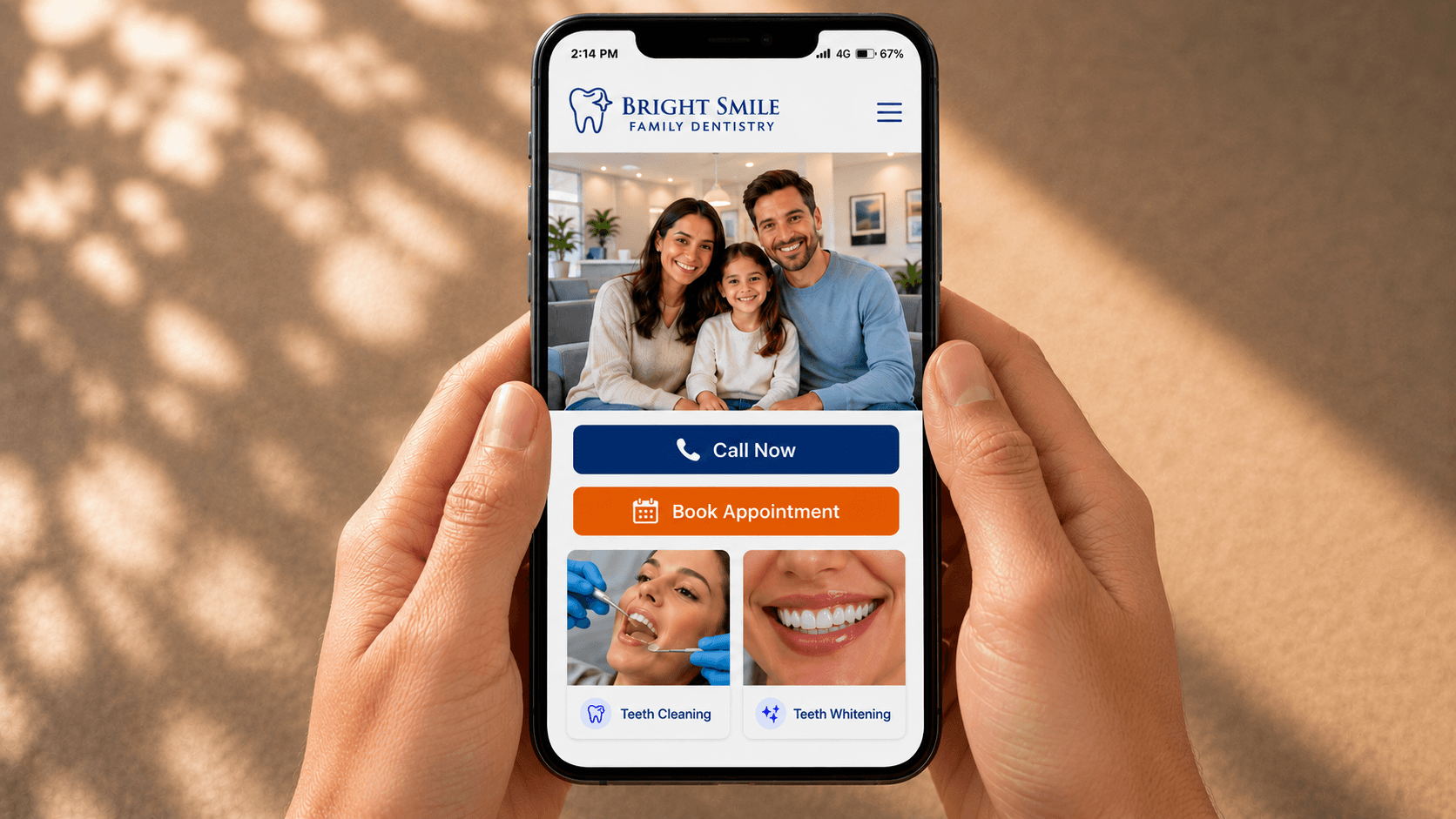
Should click-to-call come before booking on a mobile dental website?
On a phone screen, click-to-call should be the primary action above the fold. New patients reaching for a phone are higher-intent than form-fillers, and most adult patients still prefer voice contact for a first dental visit. Booking is a strong secondary, never the only path.
There's a reason every emergency dental search ranks the click-to-call result at the top. A toothache patient at 8 p.m. doesn't want to type their name into a form. They want a human voice. BrightLocal's Local Consumer Review Survey consistently finds that 87% of consumers read online reviews before contacting a local business, and a tappable phone number is what closes the gap between research and conversation.
Make sure that phone number is doing the work. It should be tappable, formatted as a real link with tel:, visible without scrolling, and the same number that appears in your Google Business Profile. A photo of your phone number with no link behind it isn't a click-to-call button. It's an image.
Booking is a different mental model. Patients who land in a slower mood, planning a six-month cleaning, want a calendar picker, not a phone tree. The mobile site needs both, with call as the lead and booking one tap away.
| Patient context | Primary action | Why |
|---|---|---|
| Pain, swelling, urgency | Click to call | High intent, no patience for a form |
| Routine cleaning, six-month checkup | Online booking | Low urgency, prefers self-service calendar |
| Cosmetic, consult, second opinion | Both visible | Research mode, may want a real conversation |
| After hours, weekends | Call with smart routing | Most callers won't leave voicemail |
The hard part is what happens after hours, or when the front desk is on three other calls. That's the gap DentiVoice was built to fill: every inbound call gets answered, even when no one's at the desk. A booked-online slot is great. A patient who got answered is better.
Stop sending after-hours patients to voicemail
DentiVoice is an AI receptionist that answers every inbound call, books appointments, and routes the rest to your team. See how it handles overflow and after-hours coverage.
What makes a mobile booking flow actually convert?
A converting mobile booking flow asks only for what a front desk needs to open a chart: name, phone, preferred time, and reason for the visit. Every extra field drops completion rates, especially on phones where typing is harder and patience is shorter.
Form length has a consistent impact on conversion: every additional required field is a measurable drop in completion, and that effect compounds on phones. Practical marketing guidance like HubSpot's marketing playbook reaches the same conclusion across industries. For dental new-patient booking on a phone, the right cap is four fields. Anything more belongs on the confirmation page, an email follow-up, or the intake form patients complete after they're booked.
Input types matter as much as field count. A few changes that move conversion several percentage points on phones:
- Use
type="tel"on the phone field to trigger the numeric keypad - Use
type="email"on the email field so the @ symbol stays visible - Use the native iOS or Android date picker, not a custom JavaScript datepicker
- Add autocomplete attributes so saved contact info fills in automatically
Confirmation is the last mile. After a patient submits, they should land on a confirmation screen that shows the date, time, doctor, and what to bring. Then a text message and email arrive within a minute. If your booking flow ends with "Thanks, we'll be in touch," your conversion rate is leaking.
For the deeper playbook on what to fix in the booking funnel itself, see our piece on turning dental website visitors into booked appointments.
The 8-point mobile dental website audit to run this week
This audit takes about thirty minutes and uses only your phone and Google PageSpeed Insights. Run each check on your homepage and your booking page. Anything you fail is a fix that protects new-patient acquisition before it costs you another month of lost calls.
Open the audit on your own phone, not in browser developer tools. The simulators lie about real-world performance. Here's the list:
The Mobile-First Audit Checklist
Check each item your site passes today.
Score 8 out of 8 to pass. Anything below 6 should be on your fix list this month.
Want to see what a strong mobile build looks like in production? Our teardown of dental website design examples walks through a real practice site that passes every check above. Use it as a benchmark when you compare your own audit results.
A mobile dental website isn't a project you finish; it's a target you keep hitting. Phone screens get faster, patients get less patient, and what felt good on launch day feels slow eighteen months later. The audit you ran today is the floor, not the ceiling.
The single thing that moves new-patient bookings more than any other is the first three seconds on a phone. A tappable phone number. A page that doesn't make them wait. A booking button they can hit with their thumb. Get those three right and the rest of the design problems are second-order.
If your audit score came in below six, start with whichever check costs the least to fix. Compressing your homepage images is usually a one-hour job. Adding a tel: link to your phone number takes five minutes. Both move the needle this week, not next quarter.
See DentalBase in action
Book a free demo to see how DentalBase pulls your website, calls, and patient communications into one platform built for dental practice growth.
More dental marketing resources
Sources & References
- Google: Mobile-First Indexing
- Moz: Mobile Optimization Guide
- Dental Economics: Practice Marketing
- BrightLocal: Local Consumer Review Survey
- HubSpot Marketing Blog
Sources & References
Frequently Asked Questions
A mobile-first dental website is designed for the phone view first, then adapted for desktop. Layouts, tap targets, and load order are optimized for thumbs and slower connections. The desktop version inherits from the mobile build, not the other way around.
Tap targets should be at least 48 by 48 pixels per Google's Material Design specs, or 44 by 44 points per Apple's Human Interface Guidelines. Anything smaller forces patients to aim too precisely on a moving phone screen and increases mis-taps.
Yes. Google switched to mobile-first indexing as the default in 2019, meaning the smartphone version of your site determines your rankings. If your mobile experience is stripped down or broken, that's the version scored against competitors for local search visibility.
No. Responsive design adapts a desktop layout for smaller screens. Mobile-first design starts with the phone view and works outward. A responsive site can still feel awkward on a phone if the desktop layout was the primary design target.
Four fields or fewer for new-patient booking: name, phone number, preferred time window, and reason for the visit. Every additional required field reduces completion. Move insurance, address, and medical history to the post-booking intake form patients fill out after they're confirmed.
Yes. Core Web Vitals are confirmed Google ranking signals for local search, and mobile speed scores influence them directly. Compressing images, deferring scripts, and removing heavy plugins can move LCP under 2.5 seconds, which often lifts local pack visibility within weeks.
Was this article helpful?
Written by
DentalBase Team
Expert dental industry content from the DentalBase team. We provide insights on practice management, marketing, compliance, and growth strategies for dental professionals.